Guka
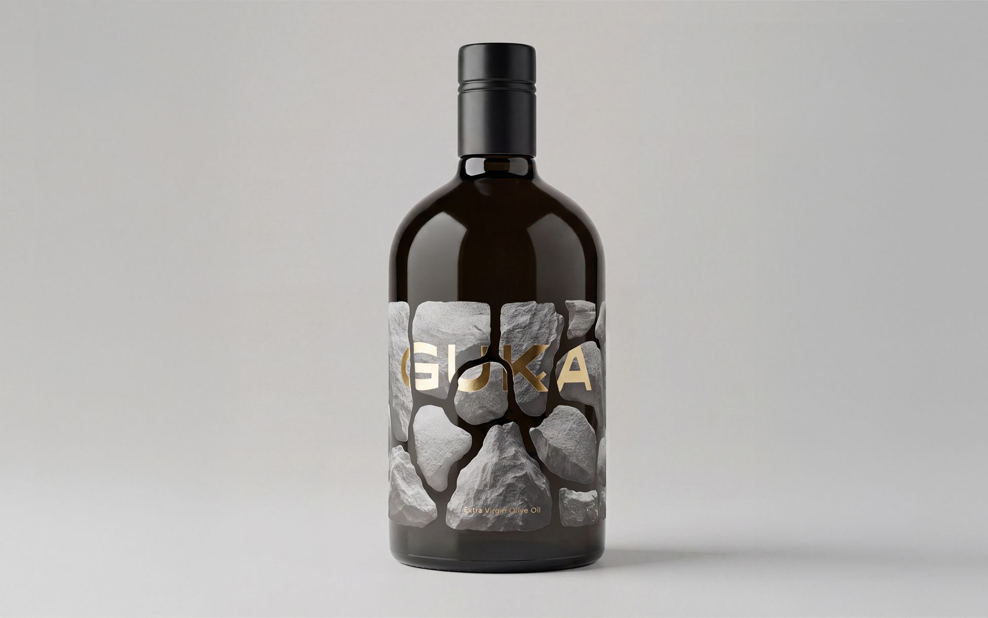
OPG Arbulić from Konavle, Dubrovnik-Neretva County, has launched a line of extra virgin olive oil. Our task was to develop a name for the new brand and create its visual identity, emphasizing the product’s connection to the local landscape, the tradition of olive growing, and the natural characteristics of the region from which it originates.
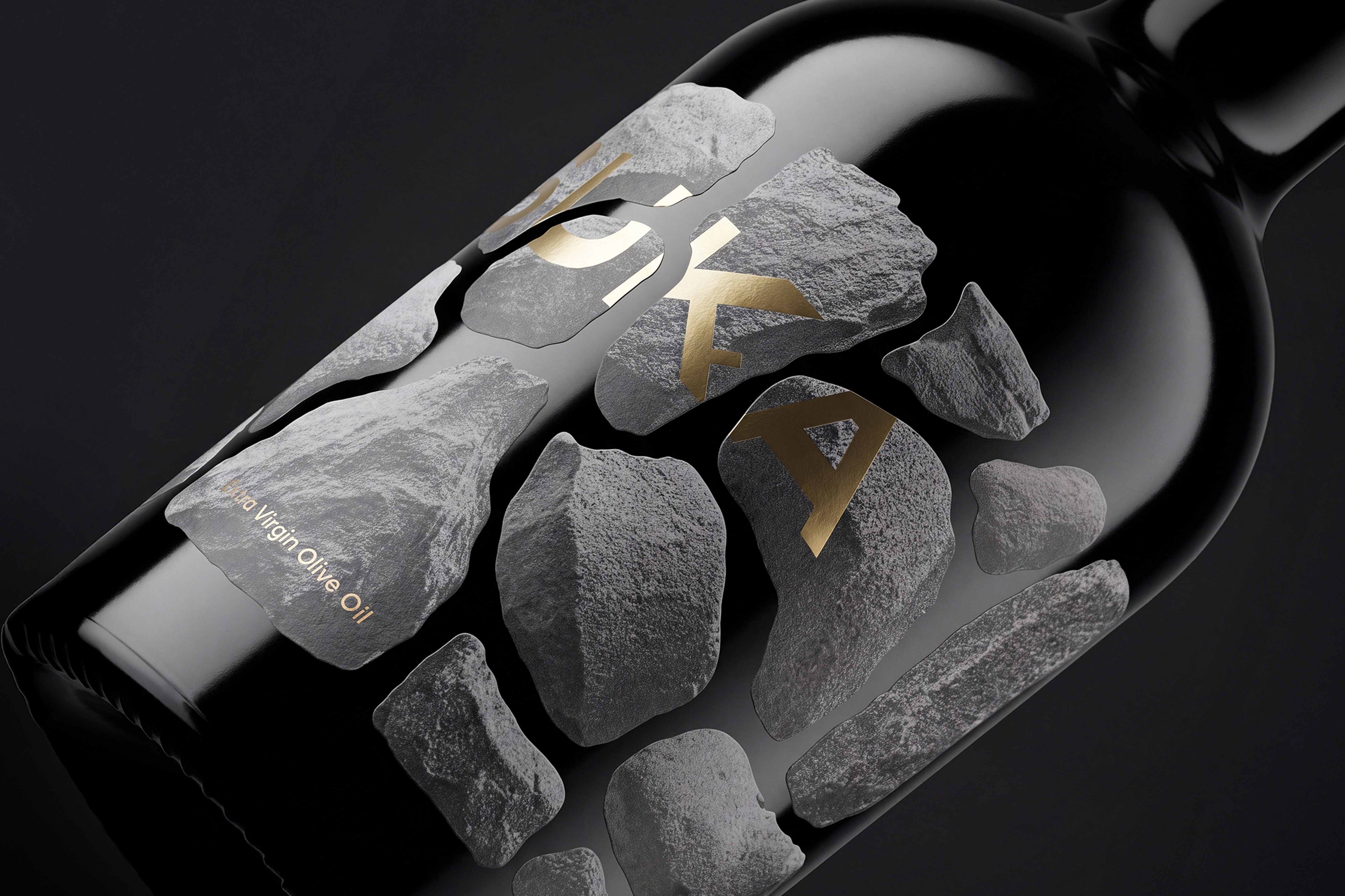
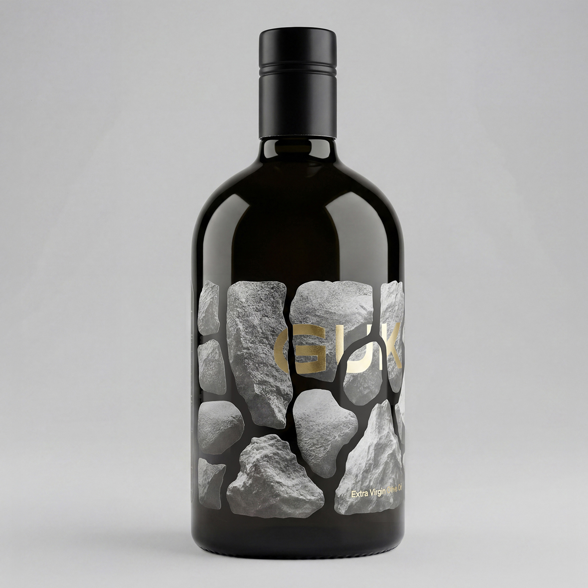
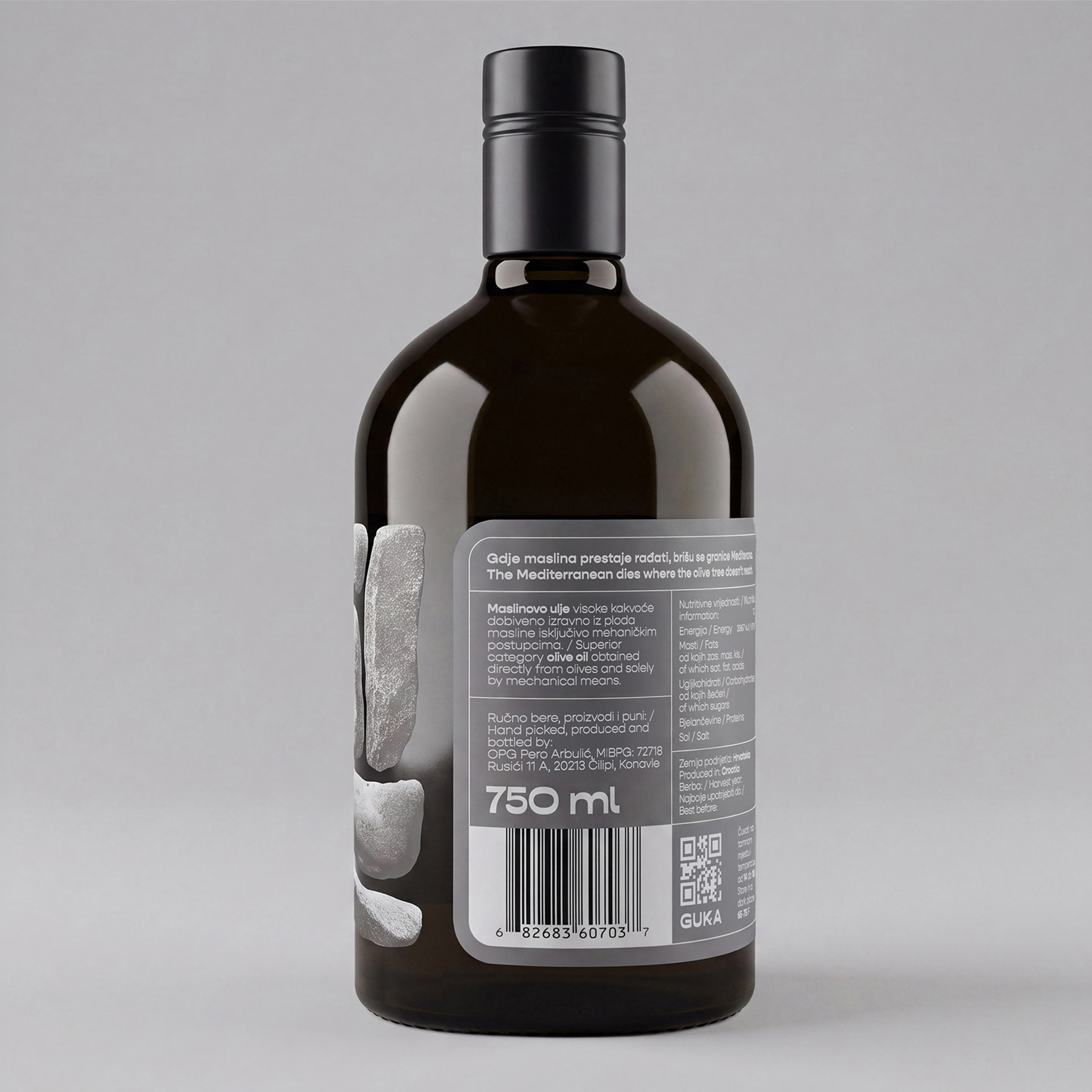
We named the new brand “Guka” after a regenerative part of the olive tree that develops at the base of young trees, enabling new shoots and roots to grow. The packaging identity is inspired by Mediterranean dry-stone walls, built from stones removed during land clearing. What was once considered excess is now an element that defines the landscape. The motif is translated onto the bottle through a stone structure resembling a dry-stone wall, with the brand name placed within it. The letter “K” takes the form of a branch with a small shoot, referencing the olive tree’s regenerative organ. Gold highlights the product name, contrasting with the matte, rough stone texture and creating a premium feel that connects tradition, nature, and quality.
Looking for more similar projects?